Mobile

Advanced Web Performance Techniques – Part 1

Happy New Year, Everyone!

Web performance is something dear to my heart and is something that can make me browse the web for hours.

My favorite holiday treat is @perfplanet‘s performance calender, every year!

  • Who doesn’t like to improve things?
  • Who doesn’t like to make things more efficient and faster?
  • Who doesn’t want Steve, Stoyan or Ilya give us that one last great webperf thought before the year ends?

Today, I’d like to write about a few techniques I’ve read about in the last few months that I consider advanced and experimental in regards to web performance.

That being said, today’s post is not about the common principles on how to make websites faster, posted by Yahoo! several years ago. While those are still valid and should be followed by every web developer and organization on this planet, I want to focus on those not so commonly known principles and techniques on how to enhance the performance of your mobile web app/site (at least the ones that still give me the “awwww – I didn’t know, wow!”). Mostly principles that can be applied to your server or CDN.

Techniques pushed by Google

I love Google’s “Make the Web Faster” site.

I only recently discovered the (experimental) features of mod_pagespeed, the open source Apache HTTP server module that automatically applies web performance best practices. Instead of making web devs do the performance work, let the web server do that job by applying filters that enhance performance.

mod_pagespeed filter: Canonicalize JavaScript

When developing (mobile) websites, developers tend to include commonly used libraries, JQuery being one of the top ones. So, imagine you browse from website A using JQuery to website B also using JQuery. The browser automatically fetches JQuery again from domain B, although it was just requested from domain A.  A waste of bandwidth, something seems inefficient here, doesn’t it? So, the great minds from Google came up with a solution to reduce the obvious inefficiency by introducing the canonicalized JavaScript filter: The idea is that you re-use commonly used libraries (e.g. JQuery) on the web by first replacing it with the equivalent library hosted on Google’s CDN and then when browsing e.g website B, use the copy of JQuery that was previously fetched from the shared library (Google’s CDN).

More about that in this blog post or the direct link.

mod_pagespeed filter: Combine JavaScript (Experimental)

Everyone who cares about web performance knows that reducing HTTP requests is one method to enhance performance. How about your web server doing this job for you? It reduces round-trips to the server and also reduces latency issues. The combine_javascript filter concatenates all used JavaScript files on one’s page and replaces it with a single one.

Check out their demo page.

More fun mod_pagespeed filters here.

Delta Delivery

This is a nice one too. I found the idea and presentation at one of the W3C Performance Working Group meetings (excellent presentations).

How often does a web developer change the entire core of their JavaScript framework or libraries? Not that often, right? So on average, one might only add another feature to the JavaScript core files that visitors need to fetch while re-visting the website. The proposed delta technique aims to reduce the size of JavaScript and stylesheets by sending only the difference “between what the client has (in cache or local storage) and the latest version”. The benefit here is that the delta will, most of the time, be smaller than the original source. “Server computes and returns encoded delta between version X and Y which is much smaller than Y itself”.

More information about “Browser Enhancements to Help  Improve Page Load Performance  Using Delta Delivery

Others & General

It’s not only Google who tries to be smart about predicting users behaviors and trying to enhance speed performance based on situational conditions.

  • Akamai has always been on the forefront of optimization and delivering content. Their situational performance techniques are fun and easy to follow. Aqua ION focuses on front-end optimization.
  • Also Cloudflare suggested their own technique called Rocket Loader to combine JavaScript and Stylesheets more efficiently.
  • Guy’s situational performance post on perfplanet’s calendar 2012.

And some client-side techniques that I don’t want to forget to mention:

This is by no means everything innovative and great that is out there to make your site faster. I appended “Part 1” to the title of this post because I know I will soon find more great techniques that will be worth mentioned. So please stay tuned.

And of course, feel free to share any other exceptional tricks worth mentioning.

Web Performance & Responsive Web Design: Disconnected or Compliant?

We’ve all been there: people throwing around the word Responsive Web Design (RWD) in web project meetings, stakeholders can’t stop talking about it, and even the non-technical Project Manager might have tried to pitch this idea to you on your elevator ride to your desk.

We have to give those optimists all credit because RWD stems from a great idea: Simple multi-screen Web Development. In general, it is indeed a great approach but not everything that is great in theory works great in practice (duh!), especially when rushed to follow a new trend.

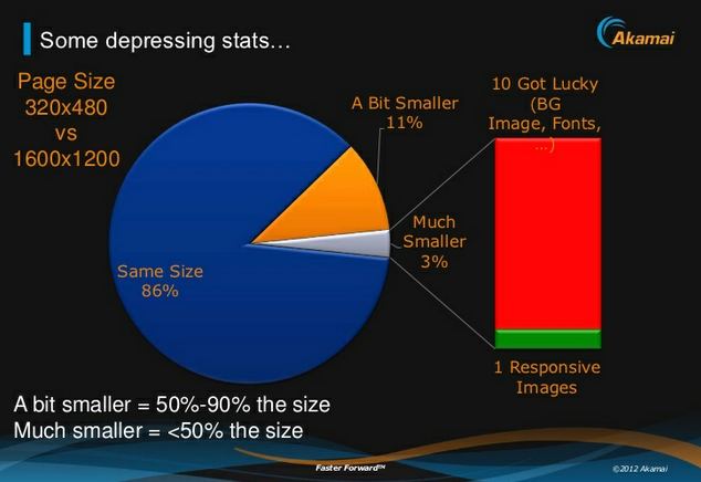
Slide 32: http://www.slideshare.net/guypod/performance-implications-of-mobile-design

Putting my mobile web performance hat on, I have to be honest, there is something that doesn’t sound quite right when my ear hears the buzz word “Responsive Web Design”. I don’t think I am very off with such perception. Please check out the screenshot I took from @guypod presentation. Guy is the Chief Product Architect at Akamai, specializing in Mobile Web Performance. I encourage everyone who is interested in Mobile Web Performance to follow his talks and tweets. His slide on the right shows that most of the websites built with responsive design in mind do not optimize for different screen sizes. This poses a problem, particularly for mobile devices.

Performance on Mobile

Performance is key for mobile websites. The latest research shows that responsive websites as of today don’t quite (yet) focus on web performance. The stats above reveal that 86% of the sites using responsive design don’t optimize for mobile. While being viewed on small-screen devices, those pages have the same page weight as the ones being viewed on a large-screen device.

Stop! Is that a negative side effect of RWD or just something that was not paid attention to? Does RWD and Web Performance go hand-in-hand or are they disconnected?

It is highly recommend to optimize your site for battery-powered mobile and small-screen devices. But what does “optimizing for mobile” mean? People might think that optimizing means they can re-arrange/optimize content and use fluid grids to be responsive for mobile devices and small screens. What I feel, they often forget is to also optimize performance for different devices and screens.

The key is to make your mobile presentation load fast on small devices.

While today’s desktop sites don’t have to be too strict on page performance (sadly, yet), sites viewed on a mobile device need to be “performance-optimized” to load content fast especially being on a cellular network.

74% of mobile visitors will abandon a website if it takes more than 5 seconds to load. In other words, you have 5 seconds to get someone’s attention. Make it count. (Brad Frost)

Further more, users appreciate pages that don’t drain battery power or add a significant amount of data usage to their data plans by using desktop-sized images or non-optimized scripts and stylesheets.

So how do you develop a responsive website that does not belong to the 86% sites that Guy mentioned in the slide above?

Here are a few risks, hints and recommendations while developing a responsive site.

Potential Risks (and Problems) with RWD

  • Performance might suffer for the sake of making a site responsive. If you make your site responsive, think about making it performance-optimized for different devices as well. Sometimes it makes sense to still serve different sites to different devices, e.g. you could have a responsive site for desktop and tablet but your mobile site uses a different implementation.
  • There is a risk of overloading-downloads (hiding content != reducing page size): If you choose to hide content based on the screen size, remember you still download the content if you do it with media queries. The page weight will stay the same. Media queries don’t prevent CSS downloads.
  • Review integrated 3rd party scripts/products: Check if the 3rd party product offers a mobile web friendly version because the desktop version might be too heavy (file size and processing). Also, make sure to identify if you need mobile sensitive logic included when using them (e.g. sometimes ads need different implementation of code for mobile vs. desktop).

Recommendations

  • Don’t be lazy and only focus on the presentation of your content being responsive, take responsibility for optimizing the performance for mobile.
  • Identify heavy and CPU intensive elements such as big images, scripts that maybe need to do things on your desktop-viewed site but maybe not on your mobile-accessed site. For those elements, you need to find a solution to optimize them for mobile. Otherwise performance will suffer and users will be upset with your pages being slow.
  • Avoid extensive client-side processing (JS scripts, non-optimized 3rd party scripts) and try to move the logic from the front-end to the back-end. Use server-side technologies to detect platform and device (capabilities) on the backend to load mobile-friendly scripts and implementations for mobile, e.g ad code, tracking, any 3rd party tools.
  • Presentation of different images sizes per platform should ideally be handled on the server side.
  • Content with only little script/logic can be displayed in a responsive matter, e.g. a box with single-column content on mobile could be displayed as two-column content on desktop.
  • Think about Mobile First (progressive enhancement) vs. Desktop First (graceful degradation).

My suggestion is to create a nice mix of server side detection and responsive design elements. And to be fair, this is not something that is new or a paradigm I created. It’s called Responsive Web Design with Server Side Components.

Go with RESS

Luke W & Dave Olson have been talking about this approach for some time now.

RESS stands for Responsive Web Design with Server Side Components and describes the combination of using responsive design approaches aligned with server side components for optimization. It helps to avoid what Guy described in his slide at the top. With server side techniques you will be able to offload some of the heavy page weight upfront before serving it to the client but still applying media queries to accomplish a responsive design approach.

And before I use the word RWD one more time, I want to end this post with a quote from Brad Frost’s presentation at the BDConf 2012 in Dallas (slide 159)

Users don’t give a s**t if your site is responsive

Responsive Design can work if you also focus on performance to make the site better and faster.

Here some links that are worth checking out:

Building and designing energy-efficient mobile websites

I was introduced to an excellent paper at the Future Insights Live in Las Vegas this year during a talk I attended and really liked by @glan.

The paper is called “Who Killed My Battery: Analyzing Mobile Browser Energy Consumption” and was presented at WWW 2012, the Mobile Web Performance Conference, France, in April 2012.

For anybody who is passionate about & interested in mobile performance and wants to know what actually kills the battery life on a mobile device when browsing the web, this is a must-read!

A few take-aways

  • Many sites are poorly optimized for energy use and rendering them in the browser takes more power than necessary.
  • Rendering images takes a significant fraction of the total rendering energy.
  • Some sites like Youtube spend around 1/4 of their rendering energy on images.
  • Javascript is one of the most energy consuming components in a web page.
  • Using generic Javascript libraries simplifies web development, but increases the energy used by the resulting pages.
  • Rendering JPEG images is considerably cheaper than other formats such as GIF and PNG for comparable size images
  • …more below in slideshare presentation

If you don’t have time and rather want a summary, you can flip through the slideshare presentation I created for an internal working group meeting at my current company.

[slideshare id=14347830&w=427&h=356&sc=no]

Link to paper: http://www2012.org/proceedings/proceedings/p41.pdf