Tag Archive for Performance

“Grunt” your way to frontend performance optimization

Performance optimization has been more than ever in the spotlight of web developers, especially for mobile web developers who have to understand and know by heart the challenges and constraints of mobile devices: these devices run off a battery that e.g. drains faster if performance is not taken seriously. The devices are powered by smaller CPUs than desktop devices. Unknown factors like latency and network connectivity challenge developers to build slim, light-weight and fast websites. Data plans still remain expensive and inconsiderate use of served data by web developers should not be ignored.

Clearly, performance is (and should) not (be) an after-thought anymore. When web developers create websites, performance can influence the success or failure of a web product. We’ve been hearing from leading performance advocates like Ilya Grigorik that speed is a feature and should not only be thought of just before a product hits production but rather as an essential part of the web product development cycle.

For example, instead of minifying and concatenating CSS and JavaScript files manually, tools and processes are out there that can help and put these performance tasks into an automated workflow, and more importantly right from the beginning of a product development cycle.

I’ve been using Maven to run most of the automated performance optimization at work, however I’ve been always interested in using Grunt for the same purpose. Grunt is a task runner, created for web products, based on JavaScript that can be leveraged to make performance part of the deployment process.

In today’s blog post I will be sharing some of the plugins for Grunt that can be used to speed up and automate performance optimization. At the end of the blog post, I will present performance results that will show that frontend optimization (FEO) can be fun and easily be automated to cut page load time.

Google’s “Make the Web Fast” team recommends frontend best practices as well as Steve Souder’s “High Performance Web Sites” outlines rules that can be applied for FEO. I decided to pick two of Steve’s rules “Make Fewer HTTP Requests” and “Minify JavaScript” (and CSS, HTML) by using Grunt plugins that can help automate those specific rules. So here it goes.

Note: The post assumes that you’ve worked with Grunt before and know how it’s been installed, and how to install plugins (I won’t go into details, however links at the bottom will help you)

“Let’s grunt it up”

(All plugin headings in this post are clickable links to their appropriate pages)

grunt-montage

Montage helps you sprite images to reduce HTTP requests. You will need ImageMagick to be installed. Alternatively, you can also try out grunt-spritefiles.

grunt-usemin

This plugin is useful when you want to develop and debug a version of your site that doesn’t use the minified and concatenated version of your JavaScript or CSS files. A comment blocks is wrapped around your JavaScript and CSS assets that will be concatenated to your destination after deployment.

<!-- build:js js/magic.min.js -->
<script src="js/1.js"></script>
<script src="js/2.js"></script>
<script src="js/3.js"></script>
<script src="js/4.js"></script>
<!-- endbuild -->

will become

<script src="js/magic.min.js"></script>

You can use grunt-processhtml instead.

grunt-closure-compiler

Alternatively you could use grunt-closure-compiler instead of combining concat and uglify and cssmin for JavaScript and CSS files.

grunt-contrib-uglify

Uglify and concat go almost hand in hand and should be used together, the concat plugin first makes sure to combine all defined JavaScript files. Uglify only works on JavaScript files. It minifies all code in a one line block of code. Use cssmin for CSS files.

grunt-contrib-cssmin

Same logic and idea than uglify, once your CSS files are all concatenated, use cssmin to shrink several lines of CSS code into one single one.

grunt-contrib-concat

Combine CSS and JavaScript files with this plugin, it allows you to reduce your HTTP requests for each and every file to just one combined file.

grunt-contrib-imagemin

imagemin minifies JPG and PNG images. It’s a handy Grunt plugin if you don’t know if the assets you got handed from your designer (or yourself) are optimized for web yet. By using this tool, you have the piece of mind that you use image files in an efficient way. Alternatively, you could use grunt-smushit, it’s based on Yahoo’s great smushit tool that is available in the YSlow plugin for several browsers.

grunt-image-embed

This plugin encodes images as base64 and leverages the technique of data URIs for images, something that can be used inline with CSS to reduce HTTP requests and hence reduce page load time. I’ve written a blog post where this is explained in more detail.

grunt-htmlcompressor

This plugin is using htmlcompressor tool to minify and compress HTML files. The options parameter is handy to tweak your compression, my example uses compressJS and preserveServerScript to also compress inline JavaScript and server script tags in case I wanted to include some SSI code.
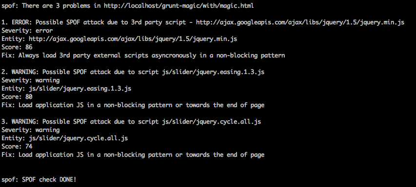
spofcheck

Use grunt-exec to run the SPOFcheck. An excellent tool to identify bad 3rd party scripts includes, developed by the eBay team. I didn’t include the scripts asynchronously, hence SPOFcheck complaints to avoid SPOF.

“It’s Magic” Sample Page

I created a simple page themed “It’s magic” where I applied all mentioned plugins. You can find the files including Gruntfile.js here. Please note, I intentionally didn’t put a lot of effort into the styling (It is supposed to look as simple and cheesy as it feels to you)

In a nutshell, the page has a logo, uses JQuery from the Google CDN, includes a simple JQuery gallery with previous and next buttons. Simple JavaScript and CSS files are being used.

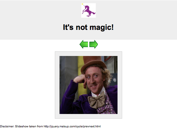
“without/magic.html”

The logo is a png logo, the images are not optimized. There are several CSS and JavaScript files that are all individual being included, not minified nor concatenated.
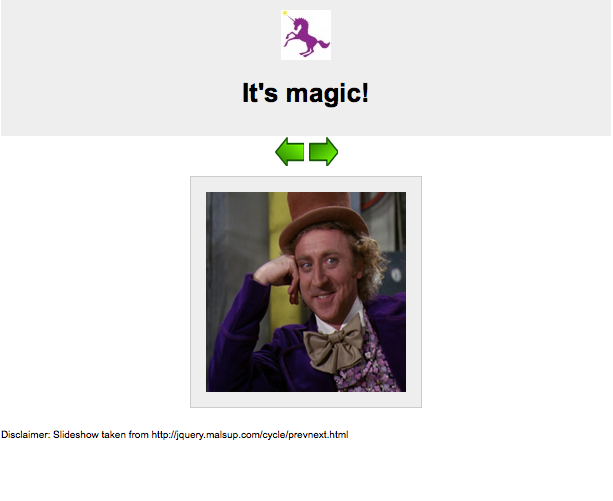
“with/magic.html”

This file is the one that Grunt will create for you. Visually, the file doesn’t look that different, besides the fact that the title has changed….see yourself

Below are screenshots of the two pages (and links) side by side, the one on the left before Grunt tasks were applied. The right one shows the page after Grunt tasks were applied. For the user they both look the same (except for the heading).

without/magic.html with/magic.html
No magic here!

Can you spot the differences?

  1. The logo was being transformed into a data URI
  2. The title has changed from It’s not magic to It’s magic
  3. The local CSS and JavaScript files were being minified and concatenated
  4. The HTML was being compressed, comments were taken out automatically
  5. The next and previous buttons were converted to a sprite file
  6. On build, SPOFcheck was applied and gave us the following warnings so we could address possible SPOF issues

Screen shot 2013-08-02 at 7.25.05 PM

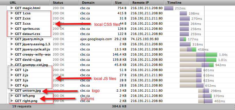
Let’s take a look under the hood

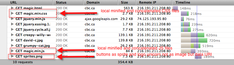
Here are the waterfalls for both versions:

Without magic
notmagic-waterfall

With magicmagic

WebpageTest Results

I ran WebpageTest for both files with 9 runs for IE8 with a DSL connection to retrieve the median. Here are the performance results:

  1. Without magic results
  2. With magic results
  • HTTP requests dropped by ~48%
  • Page load time (PLT) dropped by ~10%
  • File sizes dropped by ~10%

Even if those numbers are not that high (mostly due to the simplicity of the experiment), it shows that Grunt can help you automatically optimize your deployment process.

As you can tell by the sample code, there are many mix and match options available, depending on the magnitude and granularity of your page structure. Nevertheless, this little sample shows how to use Grunt to optimize performance and to illustrate what is possible. Feel free to use the code as a starting point, and tweak or customize it to your likings.

General references and info to get you started with Grunt

Web Performance & Responsive Web Design: Disconnected or Compliant?

We’ve all been there: people throwing around the word Responsive Web Design (RWD) in web project meetings, stakeholders can’t stop talking about it, and even the non-technical Project Manager might have tried to pitch this idea to you on your elevator ride to your desk.

We have to give those optimists all credit because RWD stems from a great idea: Simple multi-screen Web Development. In general, it is indeed a great approach but not everything that is great in theory works great in practice (duh!), especially when rushed to follow a new trend.

Slide 32: http://www.slideshare.net/guypod/performance-implications-of-mobile-design

Putting my mobile web performance hat on, I have to be honest, there is something that doesn’t sound quite right when my ear hears the buzz word “Responsive Web Design”. I don’t think I am very off with such perception. Please check out the screenshot I took from @guypod presentation. Guy is the Chief Product Architect at Akamai, specializing in Mobile Web Performance. I encourage everyone who is interested in Mobile Web Performance to follow his talks and tweets. His slide on the right shows that most of the websites built with responsive design in mind do not optimize for different screen sizes. This poses a problem, particularly for mobile devices.

Performance on Mobile

Performance is key for mobile websites. The latest research shows that responsive websites as of today don’t quite (yet) focus on web performance. The stats above reveal that 86% of the sites using responsive design don’t optimize for mobile. While being viewed on small-screen devices, those pages have the same page weight as the ones being viewed on a large-screen device.

Stop! Is that a negative side effect of RWD or just something that was not paid attention to? Does RWD and Web Performance go hand-in-hand or are they disconnected?

It is highly recommend to optimize your site for battery-powered mobile and small-screen devices. But what does “optimizing for mobile” mean? People might think that optimizing means they can re-arrange/optimize content and use fluid grids to be responsive for mobile devices and small screens. What I feel, they often forget is to also optimize performance for different devices and screens.

The key is to make your mobile presentation load fast on small devices.

While today’s desktop sites don’t have to be too strict on page performance (sadly, yet), sites viewed on a mobile device need to be “performance-optimized” to load content fast especially being on a cellular network.

74% of mobile visitors will abandon a website if it takes more than 5 seconds to load. In other words, you have 5 seconds to get someone’s attention. Make it count. (Brad Frost)

Further more, users appreciate pages that don’t drain battery power or add a significant amount of data usage to their data plans by using desktop-sized images or non-optimized scripts and stylesheets.

So how do you develop a responsive website that does not belong to the 86% sites that Guy mentioned in the slide above?

Here are a few risks, hints and recommendations while developing a responsive site.

Potential Risks (and Problems) with RWD

  • Performance might suffer for the sake of making a site responsive. If you make your site responsive, think about making it performance-optimized for different devices as well. Sometimes it makes sense to still serve different sites to different devices, e.g. you could have a responsive site for desktop and tablet but your mobile site uses a different implementation.
  • There is a risk of overloading-downloads (hiding content != reducing page size): If you choose to hide content based on the screen size, remember you still download the content if you do it with media queries. The page weight will stay the same. Media queries don’t prevent CSS downloads.
  • Review integrated 3rd party scripts/products: Check if the 3rd party product offers a mobile web friendly version because the desktop version might be too heavy (file size and processing). Also, make sure to identify if you need mobile sensitive logic included when using them (e.g. sometimes ads need different implementation of code for mobile vs. desktop).

Recommendations

  • Don’t be lazy and only focus on the presentation of your content being responsive, take responsibility for optimizing the performance for mobile.
  • Identify heavy and CPU intensive elements such as big images, scripts that maybe need to do things on your desktop-viewed site but maybe not on your mobile-accessed site. For those elements, you need to find a solution to optimize them for mobile. Otherwise performance will suffer and users will be upset with your pages being slow.
  • Avoid extensive client-side processing (JS scripts, non-optimized 3rd party scripts) and try to move the logic from the front-end to the back-end. Use server-side technologies to detect platform and device (capabilities) on the backend to load mobile-friendly scripts and implementations for mobile, e.g ad code, tracking, any 3rd party tools.
  • Presentation of different images sizes per platform should ideally be handled on the server side.
  • Content with only little script/logic can be displayed in a responsive matter, e.g. a box with single-column content on mobile could be displayed as two-column content on desktop.
  • Think about Mobile First (progressive enhancement) vs. Desktop First (graceful degradation).

My suggestion is to create a nice mix of server side detection and responsive design elements. And to be fair, this is not something that is new or a paradigm I created. It’s called Responsive Web Design with Server Side Components.

Go with RESS

Luke W & Dave Olson have been talking about this approach for some time now.

RESS stands for Responsive Web Design with Server Side Components and describes the combination of using responsive design approaches aligned with server side components for optimization. It helps to avoid what Guy described in his slide at the top. With server side techniques you will be able to offload some of the heavy page weight upfront before serving it to the client but still applying media queries to accomplish a responsive design approach.

And before I use the word RWD one more time, I want to end this post with a quote from Brad Frost’s presentation at the BDConf 2012 in Dallas (slide 159)

Users don’t give a s**t if your site is responsive

Responsive Design can work if you also focus on performance to make the site better and faster.

Here some links that are worth checking out:

Why bashing Facebook’s HTML5 hybrid app is mean and doesn’t make sense

Whaaaaat? Another one of those “Facebook’s native app is faster” posts – No! You won’t hear this from me.

After I had heard from posts/people that FB would be changing their core mobile architecture for their iOS app from more-or-less hybrid to native again, I had been waiting impatiently for the release. So there it was in the app store, as a big advocate for mobile web, I was almost afraid to launch the new FB native iOS app because I didn’t want it to be faster because I could not comprehend why a company like FB could not have engineers figure out this new HTML5 beast.

Well, I launched the app. It loaded. Fast, faster than I thought, the scrolling wasn’t sluggish anymore. Native development succeeded? Not so fast my friend! I made sure I’d read the FB engineering blog post that explained the architecture behind the latest iOS app they built.

“For areas within the app where we anticipate making changes more often, we will continue to utilize HTML5 code, as we can push updates server side without requiring people to download a new version of the app.”

To me that sounds pretty hybrid, no? – Nobody said hybrid is all webviews and no native components. So why the fuss? They identified the areas where pure HTML5 didn’t work quite well yet, either because of their backend/architecture was not setup to deal with mobile web/HTML5 parts due to maybe bloaded old JS or because certain elements should not be done via webview in general, e.g infinite scrolling that can’t perform well within an iOS webview.

Here,  Facebook’s engineering manager Dave Fetterman explained about a year ago FB’s approach to HTML5 and its challenges.

“HTML5 is probably the way that we should have done it. This is the way we get to do it now because HTML5 has changed so much under our feet. The initial attempt at building a hybrid application, there were certain things in HTML5 that weren’t ready yet and we said forget it, we are going to keep moving forward.”

There have been many people out there expressing their views on Facebook and HTML5. Here are some I liked and could agree with.

From the comments block at mashable.com, Esteban Saa writes:

I’ll take this opportunity to write about how Apple in order to maintain control over their app market are creating problems for HTML5. For instance they won’t let use run our web apps at full JS speed stating security issues, which everyone knows is BS. Don’t get me wrong I love Apple products, but practices like these really hurts the evolution of software.

Mobile Marketer interviewed people in the industry and got the following opinions

“Facebook by all accounts, didn’t make mobile its top priority early on,” he said. “As a consequence, they underinvested in their mobile experience (i.e. HTML5) over the past two years. (…) With other companies such as Netflix, LinkedIn, and Instagram, they committed fully and put their best resources on it. Facebook tried to recycle too many things from their desktop technology into HTML5 instead of starting with an approach fully optimized for mobile.”

And finally Tobie was sent from FB to come forward explaining what’s slowing down the Facebook HTML5 app

Scrolling performance
------------------------
I've already started sharing some of it with the W3C WebPerf WG[4]. Will
continue bringing it to other relevant WG in the upcoming weeks.

This is one of our most important issues. It's typically a problem on the
newsfeed and on Timeline which use infinite scrolling (content is
prefetched as the user scrolls down the app and appended) and end up
containing large amounts of content (both text AND images). Currently, we
do all of the scrolling using JS, as other options were not fast enough
(because of implementation issues).

My honest opinion based on everything I read on the internet, etc, and my own brain:

  • FB underestimated mobile web, hence they didn’t care much about mobile, and did not built their previous hybrid app accordingly with any potential growth of mobile web user base.
  • They didn’t care about mobile that much because they didn’t know back then how to monetize it with ads. Of course, Facebook is huge and has so many smart engineers working there but they also have smart product managers, and we all know that FB is not making (much) money with their mobile products because they don’t include ads. I would argue that the focus on mobile has never been that big at Facebook to begin with and hence the apps & mobile web were always low-priority.
  • They tried their best with their knowledge back then, now they share their problems and frustration: good for us to learn from their mistakes and make it better.
  • Despite Zuckerberg admitting they made a mistake counting on HTML5, they will still continue to focus on mobile web because research says there are still more users accessing Facebook mobile web than Android and iOS together.
  • I agree with codefessions.com article “It seems as it was the rethinking of the architecture that fixed everything, not the underlying technology.”
  • HTML5 hybrid apps are not the solution for all businesses: Facebook’s infrastructure is unique and needs to handle thousand of requests constantly. Watch the velocity video (around minute one) for more details. It’s a challenge to handle loads like this, not only for mobile, but also desktop.
  • Web Apis still need to catch up to deliver native-interaction properly, hence device specific features might still need to be developed natively.

My suggestion for anybody thinking not to develop hybrid mobile web apps now, consider the following thoughts as they might convince you to shift your focus back to building hybrid/HTML5 apps.

  • Don’t use bloated JS within your webviews: You don’t need to put all your logic on the client-side, server-side mobile (app) detection and enhancements can give you higher performance as well.
  • Draw a comparison to Facebook, are you a dynamic content / social media company or a content-centric company like news broadcaster? Do you rely on complicated SQL queries or do you “just” show simple content results. How many people access your content and what kind of daily/hourly etc? What areas need to perform fast?
  • If you need to load content on the fly, e.g. with infinite scrolling, think about moving such component to a native view, not everything has to be a webview! Be smart and honest about it.
  • Evaluate each component of your hybrid app and follow the rule if the difference in terms of performance and user experience is way better with native code, use native code. I believe certain elements should be done natively, no doubt, navigation items behave less sluggish than  mobile web implementations. However certain static/less dynamic areas with content could be served in a webview.
  • Be aware of things HTML5/the browser can’t do or has problems with and try to fix them, e.g. the 300ms onlick delay.

One thing you should always strive for is making your product better and faster, no matter what you choose to use, HTML5 or a native codebase.