Note: This is a cross-post, the original post can be found as part of the 2014 perf calendar.
Generally, I prefer to mention the bad news first:
- Slow websites will always exist.
- Websites will continue to become more complex and bigger.
- Our demand for speed and patience will certainly not decline.
These facts shouldn’t come as a surprise to anyone who cares about web performance.
Predicting the future is difficult and science has not been able to make time travel possible for us to peak ahead to what will happen to web performance. However, have you paid attention to the W3C activities recently? There is some really exciting performance stuff cooking.
My contribution to this year’s performance calendar is to tell you what convenient features we can expect in the future when dealing with web performance.
The future is (almost) here
The good news is that the W3C Web Performance Working Group and browser vendors have acknowledged that performance is an important piece of web development. They have already pushed out, and continue to propose new standards and implementations for those performance APIs.
The purpose of a web API is to provide you with better access to your users’ browser and device. Performance APIs can ease the process of accurately measuring, controlling, and enhancing the users’ performance. In addition, new protocols and HTML elements have been proposed to help serve content even faster and more optimized to users. Prior to these enhancements, it was impossible for developers to accurately measure their website performance.
Please note, I added a browser compatibility table at the end of this post so you can verify each API against current browser support.
I’m excited about the future of web performance and this post describes why.
Can I get an API with that?
There are several already existing, but also new performance APIs that are currently being worked on. To ensure quality and interoperability, W3C standards go through a specification maturity process, as shown below. Starting from step 1, “Editor’s Draft” to step 5, “W3C Recommendation”. Most start landing in browsers (“behind a flag”) during the “Working Draft” phase and get refined over time. After step 3 (“Candidate Recommendation”), developers can expect the API feature to be released un-prefixed in some browsers.
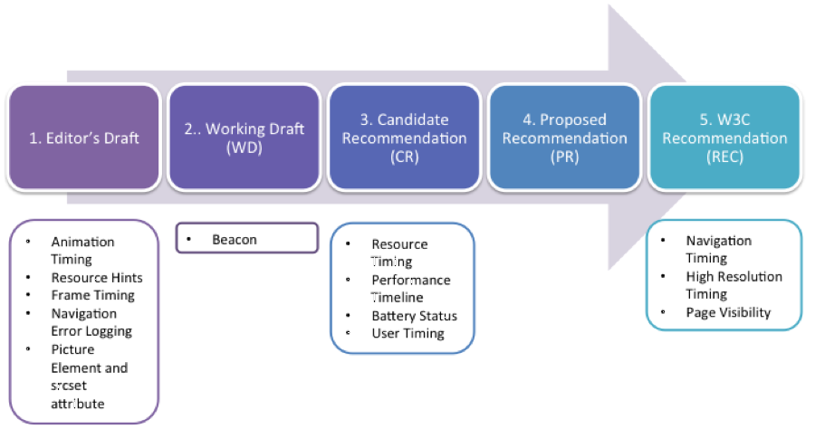
Let’s take a closer look at each API listed in the boxes above, from right to left.
Navigation Timing
This specification defines an interface for web applications to access timing information related to navigation and elements. – W3C
The Navigation Timing API helps measure real user data such as bandwidth, latency, or the overall page load time for the main page, and it is mainly used to collect RUM data.
The API allows developers to inquire about the page’s performance via JavaScript through the PerformanceTiming interface.
varpage = performance.timing,
plt = page.loadEventStart - page.navigationStart,
console.log(plt);
Navigation timing covers metrics of the entire page. To gather metrics about individual resources, please check out the Resource Timing API further down below.
You can use this API to collect performance metrics about your user, especially when using RUM as one of your measurement techniques.
Navigation Timing 2 has been announced and will replace the first version.
High Resolution Timing
This specification defines a JavaScript interface that provides the current time in sub-millisecond resolution and such that it is not subject to system clock skew or adjustments. – W3C
varperf = performance.now();
When it comes to performance, accurate measurements are very beneficial. The High Resolution Timing API supports floating point timestamps providing measurements to a microsecond level of detail.
Page Visibility
This specification defines a means for site developers to programmatically determine the current visibility state of the page in order to develop power and CPU efficient web applications. – W3C
The visibilitychange event is fired on document whenever the page gains or loses focus.
document.addEventListener('visibilitychange', function(event){if(document.hidden){}else{}});
This event is very helpful to programmatically determine the current visibility state of the page. For example, the API can be applied if your user has several browser tabs open and you don’t want specific content to execute (e.g playing a video, or rotating images in a carousel). Especially on mobile devices, this can be a great advantage in saving battery consumption for your users when they don’t have your page visible, but open in an inactive tab.
Here is a neat sample page illustrating the firing of the visibilitychange event.
Resource Timing
This specification defines an interface for web applications to access the complete timing information for resources in a document. – W3C
The Resource Timing API is a bit newer and not as well supported as the Navigation Timing API. You can dig deeper into understanding the behaviour of each individual resource of a page. Imagine you putting an image on your page, but not knowing how it performs in the real world, therefor, you would like to know the Time to First Byte (TTFB) metric for this image.
As an example, let’s pick the performance calendar logo (http://calendar.perfplanet.com/wp-content/themes/wpc/wpclogo.png).
varimg = window.performance.getEntriesByName("http://calendar.perfplanet.com/wp-content/themes/wpc/wpclogo.png")[0];
varttfb = parseInt(img.responseStart - img.startTime),
total = parseInt(img.responseEnd - img.startTime);
console.log(ttfb); console.log(total); logPerformanceData('main logo', ttfb, total);
If Timing-Allow-Origin header is set by third party providers, you can even check the performance of third party resources on your page.
Beyond the main page’s performance (via Navigation Timing API), you can track real user experiences on a more granular basis (i.e. resource-basis). By having knowledge of this data, you can find potential performance bottlenecks for a specific resource.
Performance Timeline
This specification defines an unified interface to store and retrieve performance metric data. This specification does not cover individual performance metric interfaces. – W3C
The Performance Timeline specification defines a unifying interface to retrieve the performance data collected via Navigation Timing, Resource Timing and User Timing.
varperf = performance.getEntries();
for(vari = 0; i < perf.length; i++){console.log("Asset Type: " +
perf[i].name +
" Duration: " +
perf[i].duration +
"\n");
}
Check out the detailed post by Andrea Trasatti on the performance interface. He created a tool to generate HAR files from the performance timeline API, which provides you with a timeline view of performance metrics as they happen. You can plot the results as well. Andy Davies created a great waterfall bookmarklet to illustrate this.
Battery Status
This specification defines an API that provides information about the battery status of the hosting device. — Source
The API provides you access to the battery status of your users battery-driven device, as well as events that can be fired.
The charging, chargingTime, dischargingTime and level can be inquired, as well as events can fire based on these statuses.
varbattery =
  navigator.battery ||
  navigator.webkitBattery ||
  navigator.mozBattery ||
  navigator.msBattery;

if(battery){console.log("Battery charging? " + battery.charging ? "Yes" : "No");
  console.log("Battery level: " + battery.level * 100 + " %");
  console.log("Battery charging time: " + battery.chargingTime + " seconds");
  console.log("Battery discharging time: " + battery.dischargingTime + " seconds");
};
More samples and details are posted on the Mozilla Battery Status API page, as well as here
By knowing the users’ battery state, you could serve content based on the status (e.g. don’t send energy intensive elements to the user if the battery level is below 20%).
User Timing
User Timing provides a simple JavaScript API to mark and measure application-specific performance metrics with the help of the same high-resolution timers. – W3C
With the User Timing API, you can set markers to measure specific blocks or functions of your application. The calculated elapsed time can be an indicator for good or bad performance.
performance.mark("start");
loadSomething();
performance.mark("end");
performance.measure("measureIt", "start", "end");
varmarkers = performance.getEntriesByType("mark");
varmeasurements = performance.getEntriesByName("measureIt");
console.log("Markers: ", markers);
console.log("Measurements: ", measurements);
functionloadSomething(){console.log(1+1);
}
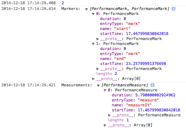
The markers can help you focus on specific activities on your page and measure important milestones when your application/website is being executed.
Beacon
This specification defines an interoperable means for site developers to asynchronously transfer small HTTP data from the User Agent to a web server. – W3C
With the beacon API, you can send analytics or diagnostic code from the user agent to the server. By sending this asynchronously, you won’t block the rendering of the page.
navigator.sendBeacon("http://mywebserver.com",
  "any information you want to sent");
Here is a neat demo page.
You can use the recommended beacon to carry performance information to a specific URL for further RUM analysis.
Animation Timing
This document defines an API web page authors can use to write script-based animations where the user agent is in control of limiting the update rate of the animation. The user agent is in a better position to determine the ideal animation rate based on whether the page is currently in a foreground or background tab, what the current load on the CPU is, and so on. Using this API should therefore result in more appropriate utilization of the CPU by the browser. – W3C
Instead of using setTimeOut or setInterval to create animations, use the requestAnimationFrame. This method grants the browser control over how many frames it can render; aiming to match the screen’s refresh rate (usually 60fps) will result in a jank-free experience. It can also throttle animations if the page loses visibility (e.g., the user switches tabs), dramatically decreasing power consumption and CPU usage.
Check out Microsoft’s demo page comparing setTimeOut with requestAnimationFrame.
Smoother animations result in happy users, low CPU usage, and low power consumption.
Resource Hints
This specification defines a means for site developers to programmatically give the User Agent hints on the download priority of a resource. This will allow User Agents to more efficiently manage the order in which resources are downloaded. – W3C
Predictive browsing is a great way to serve your users with exactly what they want to see or retrieve next. “Pre-browsing” refers to an attempt to predict the users’ activity with your page (i.e. is there anything we can load prior to the user requesting it?).
The following pre-browsing attributes are meant to help you with pre-loading assets on your page.
<linkrel="dns-prefetch"href="//host_to_resolve.com"><linkrel="subresource"href="/javascript/mydata.json"><linkrel="prefetch"href="/images/labrador.jpg"><linkrel="prerender"href="//example.org/page_2.html">
For example, if you set up tracking on your page, you probably know where your users are headed most often. You could use resource hints to pre-load subsequent resources of the next page to allow for quicker loading of that consecutive page.
Other proposals (not supported yet)
- Frame Timing
This specification defines an interface to help web developers measure the performance of their applications by giving them access to frame performance data to facilitate smoothness (i.e. Frames per Second and Time to Frame) measurements. – W3C
- Navigation Error Logging
This specification defines an interface to store and retrieve error data related to the previous navigations of a document. – W3C
Protocols, standards, and new HTML elements
HTTP/2
HTTP/2 and SPDY protocol (developed by Google) allow several concurrent HTTP requests to run across one TCP session, and provide data compression of HTTP headers.
It’s no secret that SPDY has been a huge motivation for revamping the HTTP protocol. SPDY is not HTTP/2, however, when the HTTP/2 proposals were introduced in 2012, SDPYs specifications were adopted as a starting point (one single TCP connection, HTTP header compression, Server Push etc.), see more here.
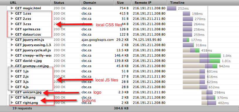
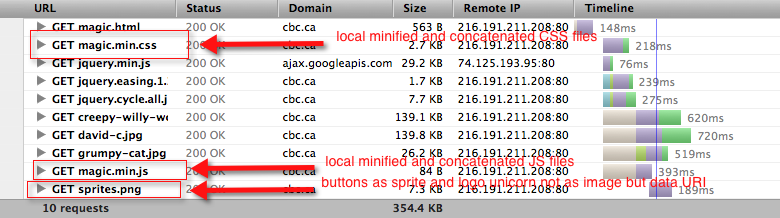
When HTTP was introduced a decade ago, latency wasn’t something that was necessarily thought about. In HTTP/1.1, only the client can initiate a request. Even if the server knows the client needs a resource, it has no mechanism to inform the client. Therefore, it must wait to receive a request for the resource from the client. HTTP/2 promises to make HTTP requests cheaper, reducing the need for us to come up with techniques (or maybe hacks?), such as CSS image sprites, inlining etc., to minimize the number of HTTP requests needed.
The HTTP/2.0 encapsulation enables more efficient use of network resources and reduced perception of latency by allowing header field compression and multiple concurrent messages on the same connection. It also introduces unsolicited push of representations from servers to clients. — HTTP/2.0 Draft 4
WebP
WebP is a lossy compression format to promise optimized image delivery for the web. WebP is open-source, developed by Google, only supported in Chrome, Opera and Android but promises 30% smaller file size than a comparable JPEG image. Big websites such as Facebook have started to adopt these techniques with great success, 90% of images sent to Facebook and Messenger for Android use the WebP format, while they see a file size decrease up to 80% from PNG to WebP.
You can convert your images using a WebP converter like ImageMagick or others.
One of the drawbacks is that as long as not all browsers support this new format, you will need to save two versions of the image, one in WebP and one in the legacy image format, resulting in more storage costs.
Some examples of WebP images can be found here.
Picture element and srcset attribute
This specification defines the HTML picture element and extends the img and source elements to allow authors to declaratively control or give hints to the user agent about which image resource to use, based on the screen pixel density, viewport size, image format, and other factors. – W3C
The <picture> element and srcset attribute provide two ways of getting responsive images in the browser. The srcset attribute allows you to target particular screen densities with images that have been scaled. The picture element, on the other hand, is primarily used for “art directed” content: where the contents of the image changes based on a CSS breakpoint. The standard <img> tag serves both a fallback and as the actual image container. Together, picture and srcset help deal with different device size, and accommodates for different image sizes when using responsive websites.
<picture><sourcemedia="(min-width: 1280px)"srcset="large-hero.jpg, large-hero-2.jpg 2x"><sourcemedia="(min-width: 600px)"srcset="med-hero.jpg, med-hero-2.jpg 2x"><sourcesrcset="small-hero.jpg, small-hero-2.jpg 2x"><imgsrc="hero-1.jpg"alt="Hero image"></picture>
Responsive image solutions can help save bandwidth by providing the most optimized image to the users’ screen width and device.
Browser support overview
The number in each column describes the browser’s version number and subsequent versions up.
| Specification |
Internet Explorer |
Firefox |
Chrome |
Safari |
Opera |
iOS Safari |
Android |
| Navigation Timing |
9 |
31 |
all |
8 |
26 |
8 (not 8.1) |
4.1 |
| High Resolution Timing |
10 |
31 |
all |
8 |
26 |
8 (not 8.1) |
4.4 |
| Page Visibility |
10 |
31 |
all |
7 |
26 |
7.1 |
4.4 |
| Resource Timing |
10 |
34 |
all |
– |
26 |
– |
4.4 |
| Battery Status* |
– |
31 (partially) |
38 |
– |
26 |
– |
– |
| User Timing |
10 |
– |
all |
– |
26 |
– |
4.4 |
| Beacon |
– |
31 |
39 |
– |
26 |
– |
– |
| Animation Timing |
10 |
31 |
all |
6.1 |
26 |
7.1 |
4.4 |
| Resource Hints |
– |
– |
Canary limited |
– |
– |
– |
– |
| Frame Timing |
– |
– |
– |
– |
– |
– |
– |
| Navigation Error Logging |
– |
– |
– |
– |
– |
– |
– |
| WebP* |
– |
– |
all |
– |
26 |
– |
4.1 |
| Picture element and srcset attribute * |
– |
– |
38 |
– |
26 |
– |
– |
*Not part of Web Performance Working Group
More information can be found here and here.
Ready, set, go?
The W3C brings together industry and community to make performance recommendations and specification reality so that developers can implement them. Please note, not all browsers implement the APIs exactly according to specification, so make sure to verify its functionality for your supported browser list.
With power comes great responsibility and while offering all these new techniques and APIs to developers, we will need to make sure that we understand their power. Browsers and content delivery networks (CDNs) have helped us quite a bit in prioritizing and optimizing web delivery. However, giving developers additional tools to boost web performance is much appreciated.
Stay up-to-date
Your best look into the future is to subscribe to the Web Performance Working Group mailing list for any performance related updates.
Disclaimer
This blog post is a compilation of different sections from my upcoming book “Lean Websites”, where I discuss not only web performance APIs, but also provide general guidance on how to create lean websites. Feel free to pre-order your copy before the book officially launches in 2015.
Happy Holidays, Everyone!

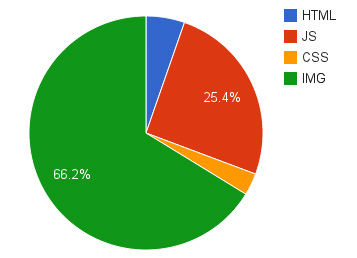 Bandwidth usage of various content types
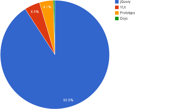 Most popular libraries