Web apps

The Answer to Your Mobile Strategy and Performance Could Simply be…ESI

ESI stands for Edge Side Include and is an XML-based markup language. ESI support is offered by content delivery network (CDN) vendors like Akamai and F5 and also now Varnish (but only a very limited subset). If you use any of these vendors, you have ESI at your disposal. ESI can be used for caching purposes, however, in today’s post I will focus on how it could help you with your mobile strategy and performance.

The W3C states:
“ESI allows for dynamic content assembly at the edge of the network, whether it is in a Content Delivery Network, end-user’s browser, or in a “Reverse Proxy” right next to the origin server.” (http://www.w3.org/TR/esi-lang)

So, let’s pay attention to “dynamic content assembly” in the context of the title’s blog post.

If you are familiar with Server-Side-Include (SSI) and XML/XSLT, you will have no problem understanding ESI. It also supports the same access to variables based on HTTP request attributes, e.g. you can easily check for HTTP_USER_AGENT or HTTP_HEADER. ESI can also include fragments or snippets of additional content via an include command. To make this even more powerful, ESI supports conditional processing, which means logic can be applied to execute specific content <include/>s based on specific conditions, e.g. user agents. All of this is done at the edge; the user will never get content they are not supposed to receive. Additionally, when processing ESI, there is no need to go back to the origin for processing, hence the load at the origin is cut down.

What is (your) Mobile Strategy?

A mobile strategy or approach could range from “We don’t have one”, or “We swear on responsive web design” to “We take mobile very seriously and have dedicated sites”. If you opt for the first statement, please read this and then come back. If you opt for the second or third statement, please continue reading. While there are several options out there to do device detection via PHP or any other server-side language, I’d like to provide several insights on how the same can be achieved with ESI. Similar to other redirect strategies out there, ESI can be used to redirect users to a different site based on the visitor’s user agent. The redirect occurs at the edge and is faster than putting the redirect logic at the origin, hence, you experience performance improvements. ESI is powerful and cheap tool, and your way to a proper mobile device strategy could work by following the steps below.

To continue, please go to my guest post for Stoyan’s perf calendar, December 3: http://calendar.perfplanet.com/2013/esi-mobile-strategy-performance/

“One Web” in a Multi-Platform World – Contradiction or Challenge, You Choose!

I read “mobile is not different” and I childishly take it personal – Why? – I dig deeper as if I was my own therapist – Why does it affect me the way it does – It feels like hopeful idealism and the need to generalize complicated things. Not a bad idea, but only if I could take that 2MB desktop site and serve it to all mobile users and think they would be happy…my job would be done! It’s not that easy, when developing web sites, you need to overcome many more obstacles for mobile than for desktop sites that are served on a high-speed, crazy powerful CPU device, a.k.a. desktop computer able to present any kind of content (text, image, audio or video). I wish I didn’t have to worry so much about performance, formats or codecs, I wish I didn’t have to think about latency and bandwidth issues, packet loss, data usage or energy consumption when delivering pages to small battery-driven devices, a.k.a. smart phones. I wish the performance budget we manifest for page size and load times would be the same for desktop and mobile, well on “one web”.

I am a big fan of consolidating so if we want to consolidate “everything web” into “one web” let’s consolidate the “proper” way then, make the “desktop” or call it “one” web follow the same strict rules that mobile or any other platform has to follow. Let’s clean up this mess (but my only wish), let’s do it properly this time please….!

What does “one web” mean to us? Deliver content to all devices, make it accessible and working for all platforms – Check, yes!

In order to get there, can we just pick one platform, develop for it and assume all the other ones will just magically start working? – Check? Unfortunately no.

Technically and realistically, I have a problem wrapping my head around this term of “there is only one web”, “mobile is not that different” or “there is no mobile web”. It is though, unless I am misunderstanding what “one” means.

I think we all perceive the notion of “one web” differently, depending on what issues we want to solve and what job title we own at present time. For example, a performance advocate would say “One web – I wish one common web to develop for, no screen real estate issues, load time or page sizes issues when developing for mobile devices! Yah!” But that’s not the case. You have way more flexibility and allowance on browser with an high-speed home internet connection. Let’s continue, if you ask the sponsor of the site or a content strategist, they’d say “yeah, one web, I want e v e r y t h i n g and I want it e v e r y w h e r e” – Is that what people mean by “one web”?

I’m not sure if we can generalize so much. Think about it, how often do we use a 3G connection on our desktop browser? Or for example, data plans for cell phones (in Canada at least) cost a lot, and going over the usage allowance by e.g 100MB costs you way more on your mobile data plan than going over 100MB on your high-speed home internet package. Also, we can’t make use of touch gestures on a desktop computer (yet) the way they come in handy e.g when swiping through photos on a mobile device.

Also, what about context aware strategies and sites. While your big iMac might want to show you all 35000 clothing items served as high-resolution photos, as a data plan payer, I would appreciate if the smart developers would not send those to my mobile device because all I want to do at the bus stop is to see where the nearest stores is and their opening hours.

One web?

Stephanie Rieger has talked about the trouble with context before. And how does “Mobile First” fit in here? Does that mean that Luke wrote a whole book for nothing if mobile is not different or should be a platform to value anymore?

It’s about adaption, no?

Let the experts comment, the W3C Mobile Web Best Practices talk about “one web” as follows:

One Web means making, as far as is reasonable, the same information and services available to users irrespective of the device they are using. However, it does not mean that exactly the same information is available in exactly the same representation across all devices. The context of mobile use, device capability variations, bandwidth issues and mobile network capabilities all affect the representation.

Hands down – I totally agree with that.

I would love to not make an iWatch (?) or iPhone or a SmartTV “different” when it comes to designing and developing web experiences for them but unfortunately they come with different challenges to deliver the same web content. When developing for touch devices you might want to use gestures, maybe you don’t want to load those gestures for your non-touch SmartTV. Your UX might break because your web site design and screen reale state rely on gestures. Your iMac might not need to know where you’re physcially at right now unless you’re taking it with you (it’s so pretty I know) while passing a Starbucks store that has free “grande iced half caf triple mocha latte macchiato” today. Do you think you would want to know about this offer while sitting with a glass of red wine, at night, at home?

May I take a stab at this and rephrase this a bit. There is the web and it is accessible and part of more and more devices (toaster, I look at you, yes I am waitin’ ….), all different in their setups, browsers, their connection limitations, their size, their CPU. Of course you need to adapt and adjust the web to each and every platform because they are different but sometimes also share characteristics. The user experience of viewing a website on a 320px wide screen in contrast to an 50inch screen is different. I believe you still have to meet different requirements at least from a design perspective.

Or even see it the other way around. Value the differences and benefit from them. Mobile devices are smarter than desktop devices. Use their advantages to your own advantages, why wouldn’t you?

I am not saying that anybody I’ve mentioned or cited in this post is wrong, we all have different perspectives and problems to solve. On that note, I’d appreciate constructive criticism because in my opinion, that only shows that we actually end up caring and worrying about the same issue, don’t you think? It’s a good thing.

In an ideal world, the web just works everywhere and serves everything but I fear we are not there yet. We sure can work towards that by creating solid back-end systems with solid and structured content and media sources that each and every platform can pull from whenever and however they want.

It’s not that “mobile is not different”, it is that “platforms are different” or “mobile is just another platform”.

Sources:

  • http://venturebeat.com/2013/03/27/heroku-mobile-lead-mobile-is-not-different/
  • http://www.w3.org/TR/mobile-bp/#OneWeb
  • http://www.the-haystack.com/2011/01/07/there-is-no-mobile-web/
  • http://www.forbes.com/sites/anthonykosner/2012/05/03/seven-deadly-mobile-myths-josh-clark-debunks-the-desktop-paradigm-and-more/
  • http://www.lukew.com/ff/entry.asp?933
  • http://www.lukew.com/ff/entry.asp?1393
  • http://www.slideshare.net/yiibu/the-trouble-with-context

Setup your own HTTP Archive to track and query your site trends

Be honest, ever wanted to play “Steve Souders” for a day and pull some cool stats or trends about some web sites of your choice? Well, how about setting up your own HTTP Archive then?

Httparchive.org is an excellent tool to track, monitor and review how the web is built. You can dig into trends around page size, page load time, CDN usage, distribution of different mimetypes and many other stats.

You can download an HTTP Archive MySQL dump and the source code from the download page and play around yourself with the current data. For example, do what Stoyan Stevanov did by asking yourself some questions: “Hm, I wonder what are common mime types these days”. Once you’ve setup the database, you can easily query anything you want.

However, what I personally find the most intriguing and fun is applying all of this to sites of of your choice. Alright, let’s break this down: if you’re famous and your site is listed under the Top * Alexa sites, then you can use the official dump, if your target site is a wee bit less famous and not part of any of the crawled sites, you might want to start using your own database and local instance of HTTP Archive. That way, you can run this handy tool on any of the web sites you want to test.

Things to consider before you get started

You need MySQL, PHP and your own webserver running. If you choose to run your own private instance of WebPagetest, you won’t have to request an API key. I decided to ask Patrick Meenan (pmeenanATwebpagetestDOTorg) for an API key with limited query access. That’suffcient for me for now, if I ever wanted to use more WebPagetest runs per day, I’d probably want to setup a private instance of WebPagetest. I’ve done this before but my computer had to be replaced, and I haven’t had the time after to set this up again.

Sample setup

bulktest: That’s the folder you really want to understand and work with when setting up your own little HTTP Archive baby.

  • bulktest/README.txt: This file gives you a general intro on how to use the folder, I recommend to read this.
  • bulktest/bootstrap.inc: In case you choose to us a private API key for WebPagetest, you will need to update this file with the provided key

To run a nice little batch, you want to execute the following scripts after each other via CLI (default setup for security reason)

  • bulktest/batch_start.php: This script takes pre-defined list of URLs (importurls.php) that you can specify or change. By default it’s downloading the latest  Alexa list (downloadAlexList()) and imports those into the urls table. I’ve changed this so it’s picking up my own csv file with the urls I want to crawl but you can also customize this the way you want it (default setup needs to run via CLI)
  • bulktest/batch_process.php: Run this as often after each other until you get confirmation that your runs were successfully recorded (default setup needs to run via CLI)

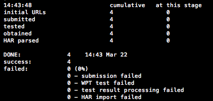
Batch summaryIt always gives you a nice batch summary at the end so you know where you are at (see screenshot)

  • bulktest/statscompute.php:  This is needed for the rendering of the stats under your local URL, e.g. http://localhost/httparchive (default setup needs to run via CLI)

More detailed steps on how to install HTTP Archive can be found under the blog post Setting up HttpArchive private instance. As suggested by the README.txt file and this blog post, it’s probably useful if you setup cronjobs in your environment to automate the batch steps.

Front-end piece: Visualizing your trends and stats by filling the charts

Congrats! Assuming you’ve successfully setup your own HTTP Archive instance  – wasn’t that fun and the bit of pain worthwhile? Now you can start viewing those charts and investigating trends and stats targeted to your defined URLs. The beautiful thing about having your own instance is that you can be your own master of data visualization: you can now create additional charts beside the ones that came out of the box provided by the default HTTP Archive setup.

And if you don’t like Google chart tools, you may even want to check out d3 or Highcharts to use instead.

From now on, the sky is the limit. Nobody can stop you now, my friend – you can even run some kick-ass raw database queries if you don’t really care much about the front-end visualization (I do ;))

Back-end piece: Querying the database directly

Sometimes, you want to get some questions answered without creating a pie or a chart. That’s when you can make use of the MySQL tables directly that have been setup for you (via schema sql file and filed by your batches).

Let’s run a simple query on the requests table.

For example, some of our sites use YUI, some use JQuery – but we would really like to avoid having pages serve both.

A simple sample query like the one below could help identify those sites:

select req_referer from requests where url like '%/i/l/yui%' or url like '%jquery-%.js' group by req_referer

Be prepared, some setup time is required

I’m not going to lie, it took me some after-work evenings, many debug statements via PHP to set everything up so I could run proper batch_start and a proper batch_process commands and fill in those pies and trends. Here are a few things to watch out for

  • I hadn’t installed pcntl with my PHP version, so I needed to set this up first. You will need this to run batch_process.php. Installing pcntl for php on osx Lion blog post helped a lot – Thank you Jacob!
  • You might have to adjust some of the tables values, I got lots of mysql insert/update errors regarding default values not set for certain fields
  • After I received my API key, I still had to change the WebPageTest URL after Patrick pointed me to the correct URL (Thanks again). The $gWPTUrl variable was set to http://httparchive.webpagetest.org as default instead of http://webpagetest.org in settings.inc
  • Some of the tables require you to have a temp/dev version of it as well, e.g. requests, urls, statsdev etc. Some of the scripts look for e.g. requestsdev. You might have to copy a few of the original tables during setup process. You can setup the naming convention in dbapi.inc

Next Steps

Where am I at? Well, I just finished a few successful batch_processes on a selected number of URLs. It’s fun to monitor trends based on the URLs I put in. I will be collecting more ideas and uses cases over the next few months, possibly also adding some more charts applicable to my needs.

If time permits, I hope to be sharing more of my customization and use cases of HTTP Archive at this year’s Velocity conference in San Jose. And if not there, I’ll try to update this blog post as best as possible. If you have any questions or suggestions, please leave a comment below.

I am always happy to receive feedback or happy help out with some roadblocks while setting this all up.

Thanks

to….

Advanced Web Performance Techniques – Part 1

Happy New Year, Everyone!

Web performance is something dear to my heart and is something that can make me browse the web for hours.

My favorite holiday treat is @perfplanet‘s performance calender, every year!

  • Who doesn’t like to improve things?
  • Who doesn’t like to make things more efficient and faster?
  • Who doesn’t want Steve, Stoyan or Ilya give us that one last great webperf thought before the year ends?

Today, I’d like to write about a few techniques I’ve read about in the last few months that I consider advanced and experimental in regards to web performance.

That being said, today’s post is not about the common principles on how to make websites faster, posted by Yahoo! several years ago. While those are still valid and should be followed by every web developer and organization on this planet, I want to focus on those not so commonly known principles and techniques on how to enhance the performance of your mobile web app/site (at least the ones that still give me the “awwww – I didn’t know, wow!”). Mostly principles that can be applied to your server or CDN.

Techniques pushed by Google

I love Google’s “Make the Web Faster” site.

I only recently discovered the (experimental) features of mod_pagespeed, the open source Apache HTTP server module that automatically applies web performance best practices. Instead of making web devs do the performance work, let the web server do that job by applying filters that enhance performance.

mod_pagespeed filter: Canonicalize JavaScript

When developing (mobile) websites, developers tend to include commonly used libraries, JQuery being one of the top ones. So, imagine you browse from website A using JQuery to website B also using JQuery. The browser automatically fetches JQuery again from domain B, although it was just requested from domain A.  A waste of bandwidth, something seems inefficient here, doesn’t it? So, the great minds from Google came up with a solution to reduce the obvious inefficiency by introducing the canonicalized JavaScript filter: The idea is that you re-use commonly used libraries (e.g. JQuery) on the web by first replacing it with the equivalent library hosted on Google’s CDN and then when browsing e.g website B, use the copy of JQuery that was previously fetched from the shared library (Google’s CDN).

More about that in this blog post or the direct link.

mod_pagespeed filter: Combine JavaScript (Experimental)

Everyone who cares about web performance knows that reducing HTTP requests is one method to enhance performance. How about your web server doing this job for you? It reduces round-trips to the server and also reduces latency issues. The combine_javascript filter concatenates all used JavaScript files on one’s page and replaces it with a single one.

Check out their demo page.

More fun mod_pagespeed filters here.

Delta Delivery

This is a nice one too. I found the idea and presentation at one of the W3C Performance Working Group meetings (excellent presentations).

How often does a web developer change the entire core of their JavaScript framework or libraries? Not that often, right? So on average, one might only add another feature to the JavaScript core files that visitors need to fetch while re-visting the website. The proposed delta technique aims to reduce the size of JavaScript and stylesheets by sending only the difference “between what the client has (in cache or local storage) and the latest version”. The benefit here is that the delta will, most of the time, be smaller than the original source. “Server computes and returns encoded delta between version X and Y which is much smaller than Y itself”.

More information about “Browser Enhancements to Help  Improve Page Load Performance  Using Delta Delivery

Others & General

It’s not only Google who tries to be smart about predicting users behaviors and trying to enhance speed performance based on situational conditions.

  • Akamai has always been on the forefront of optimization and delivering content. Their situational performance techniques are fun and easy to follow. Aqua ION focuses on front-end optimization.
  • Also Cloudflare suggested their own technique called Rocket Loader to combine JavaScript and Stylesheets more efficiently.
  • Guy’s situational performance post on perfplanet’s calendar 2012.

And some client-side techniques that I don’t want to forget to mention:

This is by no means everything innovative and great that is out there to make your site faster. I appended “Part 1” to the title of this post because I know I will soon find more great techniques that will be worth mentioned. So please stay tuned.

And of course, feel free to share any other exceptional tricks worth mentioning.

Web Performance & Responsive Web Design: Disconnected or Compliant?

We’ve all been there: people throwing around the word Responsive Web Design (RWD) in web project meetings, stakeholders can’t stop talking about it, and even the non-technical Project Manager might have tried to pitch this idea to you on your elevator ride to your desk.

We have to give those optimists all credit because RWD stems from a great idea: Simple multi-screen Web Development. In general, it is indeed a great approach but not everything that is great in theory works great in practice (duh!), especially when rushed to follow a new trend.

Slide 32: http://www.slideshare.net/guypod/performance-implications-of-mobile-design

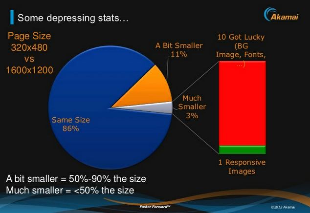
Putting my mobile web performance hat on, I have to be honest, there is something that doesn’t sound quite right when my ear hears the buzz word “Responsive Web Design”. I don’t think I am very off with such perception. Please check out the screenshot I took from @guypod presentation. Guy is the Chief Product Architect at Akamai, specializing in Mobile Web Performance. I encourage everyone who is interested in Mobile Web Performance to follow his talks and tweets. His slide on the right shows that most of the websites built with responsive design in mind do not optimize for different screen sizes. This poses a problem, particularly for mobile devices.

Performance on Mobile

Performance is key for mobile websites. The latest research shows that responsive websites as of today don’t quite (yet) focus on web performance. The stats above reveal that 86% of the sites using responsive design don’t optimize for mobile. While being viewed on small-screen devices, those pages have the same page weight as the ones being viewed on a large-screen device.

Stop! Is that a negative side effect of RWD or just something that was not paid attention to? Does RWD and Web Performance go hand-in-hand or are they disconnected?

It is highly recommend to optimize your site for battery-powered mobile and small-screen devices. But what does “optimizing for mobile” mean? People might think that optimizing means they can re-arrange/optimize content and use fluid grids to be responsive for mobile devices and small screens. What I feel, they often forget is to also optimize performance for different devices and screens.

The key is to make your mobile presentation load fast on small devices.

While today’s desktop sites don’t have to be too strict on page performance (sadly, yet), sites viewed on a mobile device need to be “performance-optimized” to load content fast especially being on a cellular network.

74% of mobile visitors will abandon a website if it takes more than 5 seconds to load. In other words, you have 5 seconds to get someone’s attention. Make it count. (Brad Frost)

Further more, users appreciate pages that don’t drain battery power or add a significant amount of data usage to their data plans by using desktop-sized images or non-optimized scripts and stylesheets.

So how do you develop a responsive website that does not belong to the 86% sites that Guy mentioned in the slide above?

Here are a few risks, hints and recommendations while developing a responsive site.

Potential Risks (and Problems) with RWD

  • Performance might suffer for the sake of making a site responsive. If you make your site responsive, think about making it performance-optimized for different devices as well. Sometimes it makes sense to still serve different sites to different devices, e.g. you could have a responsive site for desktop and tablet but your mobile site uses a different implementation.
  • There is a risk of overloading-downloads (hiding content != reducing page size): If you choose to hide content based on the screen size, remember you still download the content if you do it with media queries. The page weight will stay the same. Media queries don’t prevent CSS downloads.
  • Review integrated 3rd party scripts/products: Check if the 3rd party product offers a mobile web friendly version because the desktop version might be too heavy (file size and processing). Also, make sure to identify if you need mobile sensitive logic included when using them (e.g. sometimes ads need different implementation of code for mobile vs. desktop).

Recommendations

  • Don’t be lazy and only focus on the presentation of your content being responsive, take responsibility for optimizing the performance for mobile.
  • Identify heavy and CPU intensive elements such as big images, scripts that maybe need to do things on your desktop-viewed site but maybe not on your mobile-accessed site. For those elements, you need to find a solution to optimize them for mobile. Otherwise performance will suffer and users will be upset with your pages being slow.
  • Avoid extensive client-side processing (JS scripts, non-optimized 3rd party scripts) and try to move the logic from the front-end to the back-end. Use server-side technologies to detect platform and device (capabilities) on the backend to load mobile-friendly scripts and implementations for mobile, e.g ad code, tracking, any 3rd party tools.
  • Presentation of different images sizes per platform should ideally be handled on the server side.
  • Content with only little script/logic can be displayed in a responsive matter, e.g. a box with single-column content on mobile could be displayed as two-column content on desktop.
  • Think about Mobile First (progressive enhancement) vs. Desktop First (graceful degradation).

My suggestion is to create a nice mix of server side detection and responsive design elements. And to be fair, this is not something that is new or a paradigm I created. It’s called Responsive Web Design with Server Side Components.

Go with RESS

Luke W & Dave Olson have been talking about this approach for some time now.

RESS stands for Responsive Web Design with Server Side Components and describes the combination of using responsive design approaches aligned with server side components for optimization. It helps to avoid what Guy described in his slide at the top. With server side techniques you will be able to offload some of the heavy page weight upfront before serving it to the client but still applying media queries to accomplish a responsive design approach.

And before I use the word RWD one more time, I want to end this post with a quote from Brad Frost’s presentation at the BDConf 2012 in Dallas (slide 159)

Users don’t give a s**t if your site is responsive

Responsive Design can work if you also focus on performance to make the site better and faster.

Here some links that are worth checking out:

Building and designing energy-efficient mobile websites

I was introduced to an excellent paper at the Future Insights Live in Las Vegas this year during a talk I attended and really liked by @glan.

The paper is called “Who Killed My Battery: Analyzing Mobile Browser Energy Consumption” and was presented at WWW 2012, the Mobile Web Performance Conference, France, in April 2012.

For anybody who is passionate about & interested in mobile performance and wants to know what actually kills the battery life on a mobile device when browsing the web, this is a must-read!

A few take-aways

  • Many sites are poorly optimized for energy use and rendering them in the browser takes more power than necessary.
  • Rendering images takes a significant fraction of the total rendering energy.
  • Some sites like Youtube spend around 1/4 of their rendering energy on images.
  • Javascript is one of the most energy consuming components in a web page.
  • Using generic Javascript libraries simplifies web development, but increases the energy used by the resulting pages.
  • Rendering JPEG images is considerably cheaper than other formats such as GIF and PNG for comparable size images
  • …more below in slideshare presentation

If you don’t have time and rather want a summary, you can flip through the slideshare presentation I created for an internal working group meeting at my current company.

[slideshare id=14347830&w=427&h=356&sc=no]

Link to paper: http://www2012.org/proceedings/proceedings/p41.pdf

Why bashing Facebook’s HTML5 hybrid app is mean and doesn’t make sense

Whaaaaat? Another one of those “Facebook’s native app is faster” posts – No! You won’t hear this from me.

After I had heard from posts/people that FB would be changing their core mobile architecture for their iOS app from more-or-less hybrid to native again, I had been waiting impatiently for the release. So there it was in the app store, as a big advocate for mobile web, I was almost afraid to launch the new FB native iOS app because I didn’t want it to be faster because I could not comprehend why a company like FB could not have engineers figure out this new HTML5 beast.

Well, I launched the app. It loaded. Fast, faster than I thought, the scrolling wasn’t sluggish anymore. Native development succeeded? Not so fast my friend! I made sure I’d read the FB engineering blog post that explained the architecture behind the latest iOS app they built.

“For areas within the app where we anticipate making changes more often, we will continue to utilize HTML5 code, as we can push updates server side without requiring people to download a new version of the app.”

To me that sounds pretty hybrid, no? – Nobody said hybrid is all webviews and no native components. So why the fuss? They identified the areas where pure HTML5 didn’t work quite well yet, either because of their backend/architecture was not setup to deal with mobile web/HTML5 parts due to maybe bloaded old JS or because certain elements should not be done via webview in general, e.g infinite scrolling that can’t perform well within an iOS webview.

Here,  Facebook’s engineering manager Dave Fetterman explained about a year ago FB’s approach to HTML5 and its challenges.

“HTML5 is probably the way that we should have done it. This is the way we get to do it now because HTML5 has changed so much under our feet. The initial attempt at building a hybrid application, there were certain things in HTML5 that weren’t ready yet and we said forget it, we are going to keep moving forward.”

There have been many people out there expressing their views on Facebook and HTML5. Here are some I liked and could agree with.

From the comments block at mashable.com, Esteban Saa writes:

I’ll take this opportunity to write about how Apple in order to maintain control over their app market are creating problems for HTML5. For instance they won’t let use run our web apps at full JS speed stating security issues, which everyone knows is BS. Don’t get me wrong I love Apple products, but practices like these really hurts the evolution of software.

Mobile Marketer interviewed people in the industry and got the following opinions

“Facebook by all accounts, didn’t make mobile its top priority early on,” he said. “As a consequence, they underinvested in their mobile experience (i.e. HTML5) over the past two years. (…) With other companies such as Netflix, LinkedIn, and Instagram, they committed fully and put their best resources on it. Facebook tried to recycle too many things from their desktop technology into HTML5 instead of starting with an approach fully optimized for mobile.”

And finally Tobie was sent from FB to come forward explaining what’s slowing down the Facebook HTML5 app

Scrolling performance
------------------------
I've already started sharing some of it with the W3C WebPerf WG[4]. Will
continue bringing it to other relevant WG in the upcoming weeks.

This is one of our most important issues. It's typically a problem on the
newsfeed and on Timeline which use infinite scrolling (content is
prefetched as the user scrolls down the app and appended) and end up
containing large amounts of content (both text AND images). Currently, we
do all of the scrolling using JS, as other options were not fast enough
(because of implementation issues).

My honest opinion based on everything I read on the internet, etc, and my own brain:

  • FB underestimated mobile web, hence they didn’t care much about mobile, and did not built their previous hybrid app accordingly with any potential growth of mobile web user base.
  • They didn’t care about mobile that much because they didn’t know back then how to monetize it with ads. Of course, Facebook is huge and has so many smart engineers working there but they also have smart product managers, and we all know that FB is not making (much) money with their mobile products because they don’t include ads. I would argue that the focus on mobile has never been that big at Facebook to begin with and hence the apps & mobile web were always low-priority.
  • They tried their best with their knowledge back then, now they share their problems and frustration: good for us to learn from their mistakes and make it better.
  • Despite Zuckerberg admitting they made a mistake counting on HTML5, they will still continue to focus on mobile web because research says there are still more users accessing Facebook mobile web than Android and iOS together.
  • I agree with codefessions.com article “It seems as it was the rethinking of the architecture that fixed everything, not the underlying technology.”
  • HTML5 hybrid apps are not the solution for all businesses: Facebook’s infrastructure is unique and needs to handle thousand of requests constantly. Watch the velocity video (around minute one) for more details. It’s a challenge to handle loads like this, not only for mobile, but also desktop.
  • Web Apis still need to catch up to deliver native-interaction properly, hence device specific features might still need to be developed natively.

My suggestion for anybody thinking not to develop hybrid mobile web apps now, consider the following thoughts as they might convince you to shift your focus back to building hybrid/HTML5 apps.

  • Don’t use bloated JS within your webviews: You don’t need to put all your logic on the client-side, server-side mobile (app) detection and enhancements can give you higher performance as well.
  • Draw a comparison to Facebook, are you a dynamic content / social media company or a content-centric company like news broadcaster? Do you rely on complicated SQL queries or do you “just” show simple content results. How many people access your content and what kind of daily/hourly etc? What areas need to perform fast?
  • If you need to load content on the fly, e.g. with infinite scrolling, think about moving such component to a native view, not everything has to be a webview! Be smart and honest about it.
  • Evaluate each component of your hybrid app and follow the rule if the difference in terms of performance and user experience is way better with native code, use native code. I believe certain elements should be done natively, no doubt, navigation items behave less sluggish than  mobile web implementations. However certain static/less dynamic areas with content could be served in a webview.
  • Be aware of things HTML5/the browser can’t do or has problems with and try to fix them, e.g. the 300ms onlick delay.

One thing you should always strive for is making your product better and faster, no matter what you choose to use, HTML5 or a native codebase.

6 years later

I can’t believe 6 years have passed. I remember writing those posts below, still being on a temporary work permit in Canada, wishing to work for a bigger media company while learning lots during my first job in a media company.

Things change.

I’ve been part of the CBC mobile team since 2008, extremely proud of that and being more than ever interested in mobile web. I remember a friend from University worked for a mobile company six years ago and she was telling me that mobile will become big. I didn’t believe her back then and almost thought “who would want to develop for a crappy, small device like a phone?” Well, I proved myself wrong – There is no doubt anymore that mobile is not the next big thing, so here I am now, back as a big advocate for the mobile browser & creating mobile web apps.

I’d like to use this post to let you all know that I am back and hoping to post more valuable information here so you can witness how passionate and interested I’ve been in mobile web, mobile performance and the future of such.