
As a product manager for mobile browsers, besides being the voice of the users, it’s my ultimate mission to look ahead, collect, detect and predict mobile trends, and validate them as they fit with our users and markets. Finally, as a team, we decide what our team should focus on.
The beginning of a new year always seems to be a good time to reset, reflect, and set goals for the brand new year to come.
Mobile web is an exciting space to be in, even more so now, because last year marked an important milestone; for the first time, StatsCounter reported more people are browsing the web on their mobile devices as opposed to their desktop computers.
This write-up covers some of my reflections and aspirations to build a strong and useful Firefox browser on mobile.
Web Compatibility and Video
If a website doesn’t render content properly, the user is frustrated and will probably switch to a different browser. That, of course, applies to video as well.
“By 2020 over 75% of global mobile data traffic will be video content.”
My goal for 2017 is to make sure every video on the mobile web works on every Firefox Mobile browser. Mozilla’s platform & web compat team will be eager to help us get there. If you see a video not working on your mobile Firefox browser, let us know.
Most cat videos live on the web, and not in apps.
“Mobile web is a mile wide and an inch deep, the app is a mile deep and an inch wide.”
One of the biggest advantages of the (mobile) web is that the user doesn’t need to install an app to get their content or particular service they require. No need to sacrifice more storage on your device for yet another app that isn’t used very often. We can make use of one of the fine advantages of the web; discoverability. We have the entire web at our disposal to help users pioneer new media content.
Some questions I’d like to discuss with our UR & UX team:
- How can we make media more accessible to our users?
- How can we make media content available offline?
- Do users switch browsers if a video doesn’t play on their mobile browser (or do they “just” abandon the website)?
- How can we make the download manager better?
- What if we could create a dedicated Mobile Web Video browser?
👋 Welcome New Users in Emerging Markets
I’m not the first one to tell you this; anybody who has an interest in the mobile space knows by now to pay attention to India’s massive mobile growth in 2017 and the years to follow.
“In order to create value in India in the coming decade, companies must have a mobile-first strategy”.
What does that mean for us? Although our data shows that more people in India use an English version of our browser app, a lot of people in India consume mobile web content in Hindi (5x more). Can we localize and customize our app (even more) to accommodate non-English users?
How diverse are our users within different markets and cultures? Do they use features differently and how? For example, we’ve noticed that people in India (and Indonesia) save significantly more media content from the web to their device than in the US (almost double). Let’s investigate and help our users, no matter where they are, by finding solutions to their specific problem and needs.
India already surpassed the US smartphone market, and there will be an additional 330 million unique subscribers in India by 2020.
How can we best welcome these new smartphone users to the world of mobile browsing? Can we learn from their inexperienced and brand-new encounter with the web? What are the things that work well or don’t work at all for them? It’s a fresh new chance for us to give these 330 million new users a safe home and entry point to a safe web.
Partnerships, Cross-App Usage & Diversification
I strongly hold the belief that we should not force users to stay in our apps, rather come back more frequently; we need to foster cross-app usage, well, we actually must encourage cross-app usage. Especially on iOs where there is no concept of intents nor users are able to decide themselves their preferred default apps, we need to strengthen our partnership with other apps by forming an alliance to let users decide (rather than the OS to dictate) what apps they prefer to default to.
Stay tuned for our upcoming Firefox iOS update that will be the start of a series of cross-app pollination efforts to help with mentioned issue above.
My personal goal is to establish more cross-app partnerships this year.
Check out our “Open in Firefox” SDK for iOS if you are interested in giving users a choice when opening web content from within your iOS app.
This year will also be a year for our mobile team to experiment with single purpose apps (e.g. Focus – simple private browser), and validate if diversifying our mobile presence into multiple apps will reveal to be a successful move.
I can’t wait to experiment with some of the great ideas the team has in mind.
Artificial Intelligence
There will soon be no more mobile app, nor browser that doesn’t include some sort of AI or machine learning nuances. My colleagues from the Context Graph team currently optimize and experiment with the concept of a recommendation engine for our users. Stay tuned for more to come this year, carried out in products like Activity Stream for our mobile browsers.
Support for Diverse Input Formats
Personal home assistants like Google Home and Alexa are being operated primarily by our voices to perform tasks.
I’d like to explore and think more about voice as another input format to browse the web, be it via mentioned home assistants or be it via (other) apps on the mobile device.
And let’s not forget about the 2-in-1 devices. As a core mobile product manager, I want to make sure that our users, on these devices, can easily switch between touch, mouse or other input formats to consume any web content they want.
(Mobile) Web Performance
There can’t be a post of mine without mentioning mobile web performance.
First off, I’m so excited about Mozilla’s Quantum project. The team has already committed to deliver a fast web engine by end of 2017. In addition, our team in Taipei is knee deep in building HASAL, a framework for testing web performance between different browsers.
As for the user-facing part, we will continue to include features that will help our users browse the web faster. Obstacles such as slow loading ads, data usage and bandwidth constraints (especially in emerging markets) force us to find solutions for our users.
I want to continue to fight for fast(er) mobile websites and give users choices to understand performance and bandwidth impacts (list of mobile data related bugs)
This was a (small) selection of topics the core mobile browser team at Mozilla will work on in 2017 and the years to come.
Happy New Year, everyone! It’s going to be yet another exciting one.
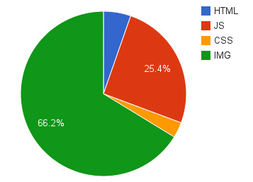 Bandwidth usage of various content types
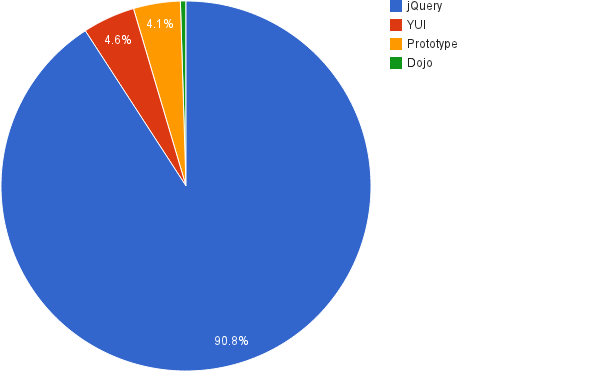 Most popular libraries


