
There is always room for improvement. Period.
Think about the 100 meter men’s sprint. I am amazed how it continues to be possible for human beings to still become faster and improve their performance.
I’m not Usain Bolt – I can’t run 100 meters in 9.58 seconds but I might be able to run (mobile) websites under 10 seconds.
Today, I want to focus on a technique I first heard about at the Velocity Conference in 2011 in Santa Clara and how to compare it with other ways to serve images in HTML pages.
Data URI is based on base64 encoding and basically encodes data (e.g. images) into bites. It can be used to improve performance.
Data URI as “Performance Enhancer”
Instead of requesting for example a PNG image, you could encode it as base64 and serve it inline with your HTML code. That way, you reduce one HTTP request – right there – 200ms saved. Instead putting it inline, you could also put it encoded in an external stylesheet.
Watch out for caching limitations though. Data URIs can’t be cached as they don’t have a standalone cache policy, they are part of the file that includes them. So they can only piggy-bag on other cacheable assets, e.g CSS or HTML files.
As Nicholas explains, if you put data URI images inline with HTML, they can only be cached as part of the HTML cache control header. If the HTML is not cached, the entire content of the HTML markup, including the inline data URI will be re-downloaded every single time. That approach, if the image is big in size, can slow down and weight down your page. Hence, one option is to to put it in stylesheets because they can have an aggressive cache while the HTML page can have no cache or a very limited cache.
Limitations and Browser Support
Think about the browser audience of the site you want to leverage data URIs for. If you target modern browsers, including new mobile devices because that’s where you really want to focus on performance the most, you might be able to ignore the following limitations and accept the little restricted list (thanks to Fire) of supported browsers.
- Firefox 2+
- Opera 7.2+ – data URIs must not be longer than 4100 characters
- Chrome (all versions)
- Safari (all versions)
- Internet Explorer 8+ (data URIs must be smaller than 32KB)
Motivation for Comparison
I’ve been reading a lot about web performance techniques and for some reason the data URI practice got stuck with me. I started off by creating the CBC gem (logo) in CSS to verify if CSS performs better than serving images. While I was playing around with that, I thought why not adding another dimension to the test and check the performance of the CBC logo as data URI. Voilà, I had my basic scenario for the test:
Check the performance of the CBC logo as
- An image in pure css
- A plain PNG image as background image
- A data URI (in CSS and inline with HTML)
Setting up the Test
The purpose of the test was to figure out what kind of presentation for the CBC gem would be the fastest and slimmest.
Prerequisites and Conditions
- All HTML and CSS files were minified and use the same markup (despite the logo in pure CSS which needed to have a few more div classes to render the circles)
- Each HTML version was tested with empty cache
- Performance results were performed with WebPagetest (10 runs on an 3G simulated browser) to find the Median.
1. Logo in pure CSS (30px x 30px)
  |
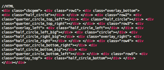 |
| Description: Thankfully, the CBC gem consists of circles, 1/2 and 1/4 circles, those shapes can easily be created with CSS. I used this page to help me get started. Instead of setting up a fixed size and color, I decided to use SASS to help me be more flexible with my settings for the logo. The scss file lets me define color and size of the gem. Note: Maybe the pure CSS logo has a bit of issues with some of the 1/4 circles but that’s probably due to some math formulas I didn’t do right in the SASS, I believe this can be ignored. Hence, This version cannot be used as the official CBC gem. |
|
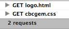
2. Plain PNG Image (30px x 30px)
  |
 |
| Description: Simple PNG file included in the CSS as a background image. CSS included in main HTML. | |
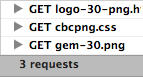
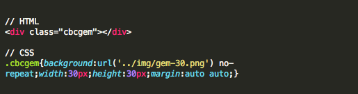
3. Data URI in CSS (30px x 30px )
  |
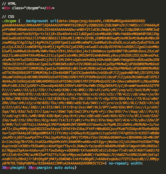 |
| Description: I used Nicholas’ tool to create my CSS files including data URI. However there are many tools to help you create your own data URI encoded files. | |
You can see from the browser screenshots above that all logos look pretty much the same to the user.
Test Results
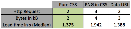
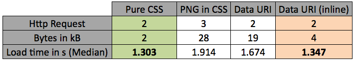
The results show that the median load times serving the logo as pure CSS in comparison to the Data URI solution are being almost the same whereas the logo as a background image in CSS took the longest.
I looked at the base64 string and thought how big it would be if I had used a bigger image. So I googled and found the following “It’s not worth to use data URIs for large images. A large image has a very long data URI string (base64 encoded string) which can increase the size of CSS file.” (source). I decided to test it out myself. So, my next question was “How would the test above turn out if I used a bigger CBC gem logo”. I picked a width and height of 300px. While I was preparing the 300px x 300px pages, I also decided to create another version of the Data URI, not part of the CSS but inline within the HTML.
1. Logo in pure CSS (300px x 300px )
There was not much of a different in terms of markup and setup for the pure CSS and PNG in CSS version. I updated the SASS for the cbcgem.scss to accomodate a logo of 300px x 300px instead of 30px x 30px. The file size didn’t change much because it is all based on math calculations
2. Plain PNG Image (300px x 300px )
Instead of loading gem-30.png, I created a version gem-300.png and updated the CSS.
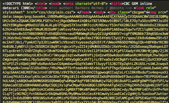
3a. Data URI in CSS (300px x 300px)
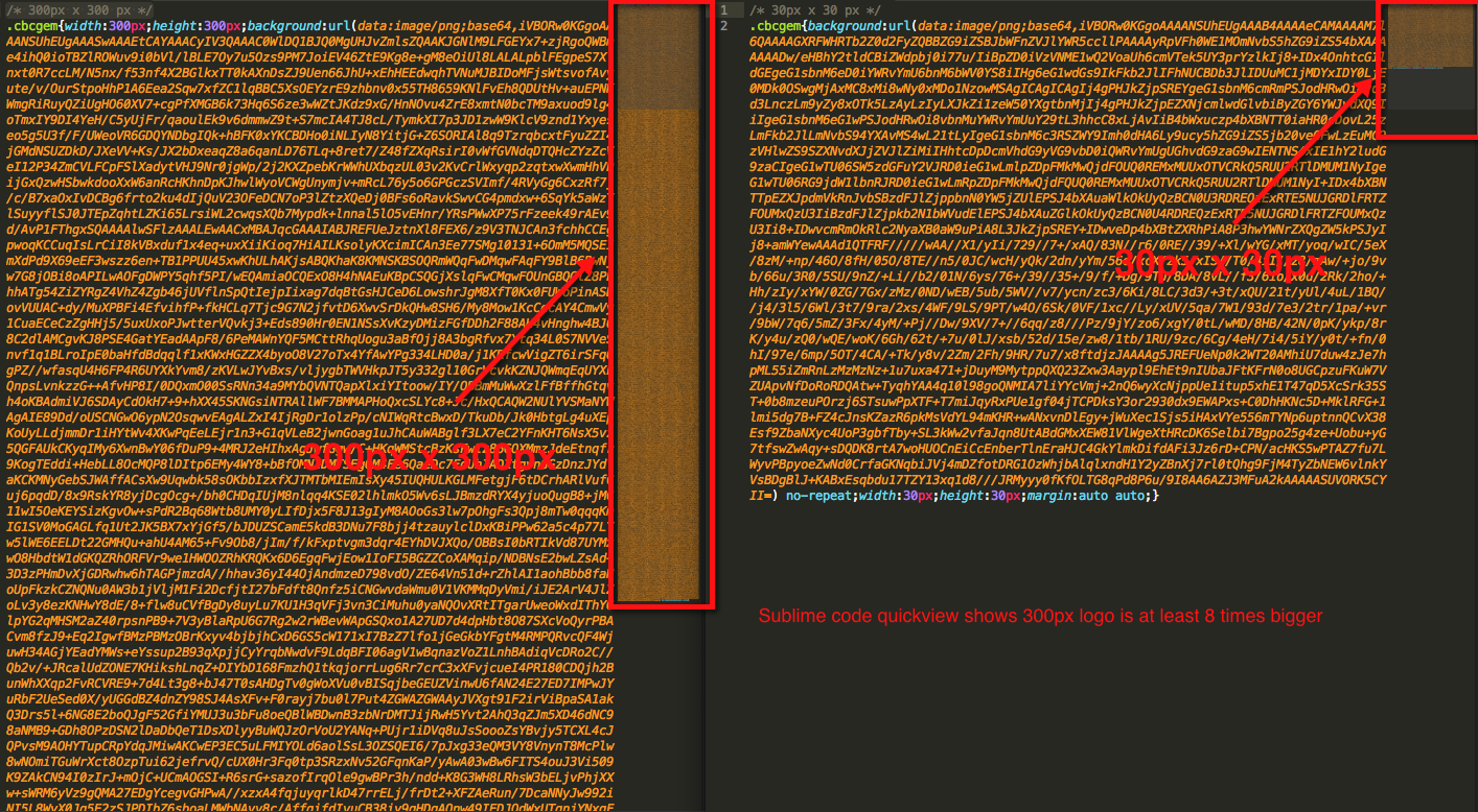 I noticed that the size of the Data URI encoding as expected increased dramatically from a 30px x 30px encoded image to a 300px x 300px image (almost 10 times, see full view of screenshot on the left).
3b. Data URI inline within HTML (300px x 300px)
 Instead of pasting the long base64 string into the CSS, I added it as an img src to the HTML page (see full view of screenshot on the left)
I used WebPagetest again to run 10 tests to find the Median.
 The links to the WebPagetest results can be found at the bottom of this post.
Observations & Take-Aways
- Creating simple shapes in CSS (via SASS) is highly scalable because it doesn’t influence the size of the CSS file significantly. The size of the CSS file won’t change much if I choose to produce a 300px x 300px logo or a 10px x 10px logo. For all tests performed this solution seems to be the most efficient and fastest one.
- I didn’t find the observation true that if the encoded image is bigger than 1-2kB it wouldn’t be worth using Data URI to improve performance. When looking at the last test round (300px x 300px), we can see in the results that the page with the encoded image is still faster than the page with a 300px x 300px PNG image.
- It is interesting to note that the inline data URI version is faster than the data URI CSS version (and almost as fast as the pure CSS version). Having to serve 2 HTTP requests with a total size of 4kB, the median load time was faster than the one serving the data URI via CSS.
Further Readings and References
- Data URIs explained (by Nicholas C. Zackas)
- Data URI Sprites
- Data URIs explained
- High Performance Web Apps. Use Data URIs. Theory
- High Performance Web Apps. Use Data URIs. Practice
WebPagetest Results
CBC Gem 30px x 30px
- Pure CSS: http://www.webpagetest.org/result/130417_5Q_179
- PNG: http://www.webpagetest.org/result/130417_4S_181
- Data URI: http://www.webpagetest.org/result/130417_9S_16K
CBC Gem 300px x 300px
